2 Architects: One dead, one alive.
3 axonometric amalgamations for each architect and their 3 concepts:
12 Sketches:
3 parallel projections exploring the interconnection between pairs of your drawings:
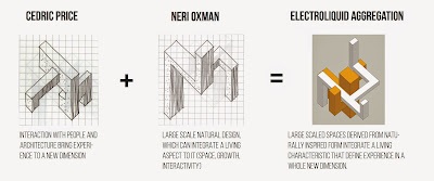
Cedric Price's concept: "Interaction with people and architecture bring experience to a whole new dimension", was derived from his works such as the Fun Palace which would serve its purpose based upon the activity taken place. It is therefore, that the space itself would bring a certain level of experience, a new dimensional way of thinking that generated a closer connection between man and architecture.
In Neri Oxman's case, her works were based on organic, growth related architecture which drew upon the natural world. Even though she experimented with man made materials, a certain presence of large scale in combination with this biological understanding, she clearly emphasises on using materials that have a living presence about it and thus challenged the notion of man made materials and the way it can be perceived in the world.
Using the Artisan tool in Google Sketchup:
36 Custom Textures:
Voronoi diagram sketch attempt:
Development of design:
I chose to develop the second concept:
Large scaled spaces derived from naturally inspired from integrate a living characteristics that define experience in a whole new dimension.
I started off with the axonometric block design built in sketchup which I imported into Lumion. Thus below shows possible preliminary marker design in Lumion where I tested scale and potential multifunctional purposes. This image in particular resulted with my own interpretation of an organically shaped form morphed together with a space which could be used as a children's play area to wander through and around or a bus stop to temporarily dwell in.
I quite like the fact that its large scale makes you feel like a child again, almost as though you are in amongst another world, an oasis. A utopia.
It was from here that I wanted this marker design to explore the natural world that Aboriginal people have lived in by designing a form which would draw the manmade objects (such as the bridge and road) into an organic freeform. Essentially, this would illustrate growth and ultimately interest from what already existed there.
Instead of understanding each concept that I've derived from Cedric Price and Neri Oxman in their works (2 Short texts describing the architectural concepts):
- Interaction between people and architecture bring experience to a whole new level
- Large scale natural design can integrate a living aspect to it (space, growth, interactivity)
I felt that both actually blended together harmoniously and thus the space in which to dwell in (rectilinear form) was also the childlike space that you could wander in and around (curvilinear). In order to do this, I limited the spaces into a facade (specifically a surface) which would morph into spaces that would both provide shade, but not necessarily be enclosed from the natural world. The bridge itself was an object that I wanted to explore the use of, by morphing its presence to this organic form and allow the marker to immerse itself as though it was meant to be there. But of course, one of the most important things that were considered was its presence when viewed on a highway. An interesting and fluid form is certainly one that will stick to the viewer and when driven past at a great amount of distance over time, there is unlikely a high chance of it being unrecognised due to its extended form to be seen once crossed to the other side. This is also presented as a monumental structure shading the driver from a tall distance when driven on the bridge.
Finally, the final design shows the naturally shaped freeform inspired from Aboriginal designs and patterns. This was also drawn from a combination of a few of the 6 texture sketches as shown above, most specifically the first, second and fifth columns.
The structure itself is presented lightweight, thus must be bolted down to either sides of the bridge, yet still maintains a sense of growth as a feature of the landscape. Just as the concepts have suggested, this marker is definitely one that encourages interaction between people and the architecture to present itself with a new dimension by turning away from the man made highway. However, most importantly as it is representative of being comprised of a living characteristic that Neri Oxman is known to use in her works to ultimately engage those to interact with it, and essentially define the movement and ever-growing spirit of Blacktown International Sports Park.
This marker is known as Waterfall.
5 Real time image captures showing a lumion environment:


